







Creating a custom Tarot or Oracle deck is a labor of love, often requiring hundreds of hours of creative passion. But we understand the anxiety that follows: handing your masterpiece over to a manufacturer.
Will the colors wash out? Will the cards feel flimsy? Will the factory stop responding when global logistics get complicated?
As a manufacturing partner that collaborates with independent creators every day, we believe printing shouldn’t be a gamble. Here are the 5 most costly printing mistakes that can undermine a crowdfunding campaign—and exactly how to avoid them.
Mistake #1: Settling for Standard “300gsm Art Paper”
You’ve spent the last year perfecting the exact shade of midnight blue on your Moon card. You launch, hit your funding goal, and the manufacturer delivers your first physical prototype on “standard” 300gsm stock.
You pick it up, and your heart sinks. It feels thin—more like a promotional flyer than a premium, mystical tool.
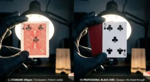
The Industry Secret: 300gsm art paper is excellent for basic flashcards or mass-market board games, but for an indie deck, it’s a trap. If you hold a standard 300gsm card to the light, you can often see the shadow of the back design bleeding through. This instantly diminishes the professional feel of your project.
The Solution: Upgrade Your Stock for a Premium Tactile Experience
-
The Heavyweight (350gsm Premium Art Paper): This is the “sweet spot” for a satisfying, robust feel and excellent durability for daily readings.
-
The Professional’s Choice (310gsm or 330gsm German Black Core): These cards feature an ultra-thin layer of graphite in the center. This guarantees zero light-bleed and gives the deck an addictive, snappy “rebound” when bridging and shuffling.
Mistake #2: The “Glossy Curse” and Muted Color Depth
Let’s be honest: nothing ruins a moody, beautifully illustrated deck faster than a cheap, high-gloss finish.
Under standard room lighting, glossy cards often reflect so much glare that the artwork becomes invisible. Furthermore, standard coatings can make deep blacks look like muddy grays and turn vibrant reds into a flat orange.
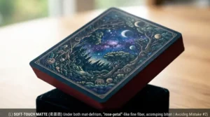
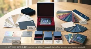
The Solution: Embrace Matte and Soft-Touch Finishes For a modern, high-end deck, we recommend Anti-Scratch Matte or a Soft-Touch (Velvet) finish. Soft-touch lamination provides a “rose-petal” texture that feels incredibly luxurious. More importantly, a matte finish absorbs light, allowing the true richness and contrast of your CMYK colors to pop. When paired with G7-certified color management, your art will look exactly as you envisioned it on screen.
Mistake #3: Brittle or “Sticky” Gilded Edges
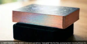
Adding holographic or metallic foil to the edges is the most effective way to elevate your retail value. Backers love a glowing deck. However, edge gilding is notoriously difficult to execute correctly.
If done cheaply, the foil can bleed between cards, acting like glue. When your backers try to shuffle for the first time, they are forced to peel the cards apart, potentially tearing the edges and ruining the deck instantly.
The Solution: Precision Engineering Quality gilding requires precise temperature control and ultra-clean cutting dies. When vetting manufacturers, inquire about their proprietary anti-sticking processes. Beyond basic gold and silver, consider trending options like Holographic Foil, Matte Black Edges, or Rose Gold to make your deck stand out.
Mistake #4: Underestimating the Vulnerability of the Tuck Box
Imagine a backer pledging $55 for your Kickstarter campaign and waiting eight months, only for the deck to arrive with crushed corners because it was packed in a flimsy 300gsm “tuck box.”
Refunds and negative reviews can drain your profit margins overnight. The box is the first thing a customer touches; it sets the entire tone for the unboxing experience.
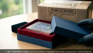
The Solution: Structural Integrity The industry standard for premium decks is the Two-Piece Rigid Box (lid-and-bottom) or a Magnetic Book Box. They are built like armor. To make the packaging unforgettable, consider adding a Linen Finish or Blind Embossing on the logo for a sophisticated, tactile effect.
Mistake #5: The Kickstarter Fulfillment Nightmare
You successfully funded your deck—congratulations! Now, you face the reality of 2,000 orders sitting in your living room. You’re looking at weeks of packing boxes, printing labels, and navigating complex customs forms, all while paying retail shipping rates.
The Solution: Direct-to-Backer (D2B) Fulfillment Work with a printing partner that offers integrated fulfillment services. Instead of shipping heavy pallets to your home, the factory can ship individual orders directly to your global backers from their facility. By providing a backer spreadsheet, you eliminate the overhead of double-shipping and, more importantly, protect your peace of mind.
Let’s Bring Your Vision to Life.
Printing shouldn’t be a gamble. You’ve poured your soul into your artwork—it deserves to be produced with perfection.
The best way to understand the “snap” of Black Core paper or the velvet texture of a Soft-Touch finish is to feel it for yourself.
Want to see our quality in person? Send us a quick message below to request our Ultimate Creator’s Sample Pack. We’ll mail you physical examples of our recent custom decks, finishes, and boxes so you can make the right choice for your project.
No pressure—just exceptional printing.