You just spent 500 hours rendering the perfect celestial theme on your iPad Pro. The deep cosmic blues and glowing neon accents look breathtaking on your backlit retina screen. But if you hand that digital file to a standard commercial printer, you are walking blindly into the CMYK nightmare. When your €60 luxury deck arrives, those deep blues might look like muddy grey, and the glowing accents might turn flat and lifeless.
To protect your artistic IP and guarantee a flawless Kickstarter playing card printing run, you don’t just need a volume-focused print shop—you need a zero-color-drift custom tarot manufacturer that understands the physics of color translation.
As factory veterans who work daily with European independent artists, we see this heartbreak all the time. Designers blame themselves for “bad files,” but the truth is usually hidden on the factory floor. Here is the insider reality of why your colors shift, and the engineering we use to permanently lock them in.
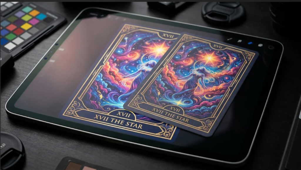
The Lie Your Screen Tells You (RGB vs. CMYK)
The screen you draw on emits light (RGB). The paper we print on absorbs light (CMYK). This fundamental gap in physics means certain colors you create digitally—like vibrant electric pinks, hyper-saturated teals, or glowing golds—literally do not exist in the standard CMYK ink spectrum.
When standard factories receive your files, their software automatically forces your vibrant out-of-gamut colors into the nearest dull CMYK equivalent. They don’t warn you; they just hit “Print.” By the time you notice the dull, muddy results, your container is already on a ship to Italy.
The Factory Trap: Gang-Run Printing
Here is a common practice in high-volume commercial printing: “Gang-running.” To offer you rock-bottom FOB prices, many factories will place your delicate tarot artwork on the exact same massive printing plate as a local supermarket’s discount flyer.
When they adjust the ink keys on the Heidelberg press to make the supermarket’s red apples look bright, it completely skews the color balance of your tarot deck on the other side of the sheet. Your colors drift wildly because your deck is sharing ink calibration with unrelated commercial materials.
How We Engineer Zero Color Drift with High-Standard Compliance
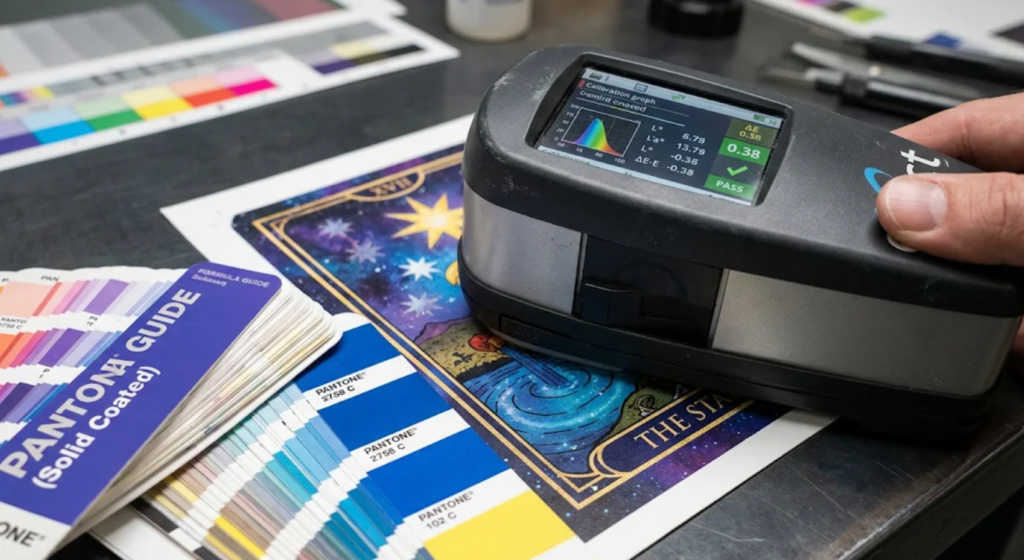
But color drift isn’t inevitable. Backed by high-standard international compliance (including FSC-certified materials and REACH/CE standards), we treat your artwork as a high-value physical asset. We completely isolate your production run and rely on strict industrial calibration.
- Dedicated Press Runs: We never gang-run your luxury decks. Your artwork owns the entire printing plate, allowing our pressmen to calibrate the ink keys exclusively for your illustrations.
- X-Rite Spectrophotometer Calibration: We do not guess colors with our eyes. We use high-tech X-Rite spectrophotometers to measure the light reflection off the paper. We lock the “Delta E” (the mathematical distance between your target color and the printed color) to strict European luxury packaging standards, keeping Delta E ≤ 2.0.
- Pantone Spot Color Intervention: During our pre-press file check, if our software detects that your signature glowing aura cannot be achieved with CMYK, we stop immediately. We consult with you to formulate a specific Pantone Spot Color ink (like a true fluorescent or metallic base) to physically match your digital vision.
Don’t leave your art to chance with standard commercial workflows. Whether you need prototype testing or low-MOQ custom manufacturing, before you launch your next Kickstarter or Gamefound campaign, send a sample of your most difficult illustration to vnkplayingcard@gmail.com. Request our Color Calibration Sample Kit to see physical proof of the difference between standard CMYK translation and true Pantone engineering.